Color
Introduction
Color helps unify Red Hat digital properties, from website experiences to application interfaces.
Color system
Our color system provides comprehensive guidelines on use, definition, and role of color in branded digital experiences.
Role of color
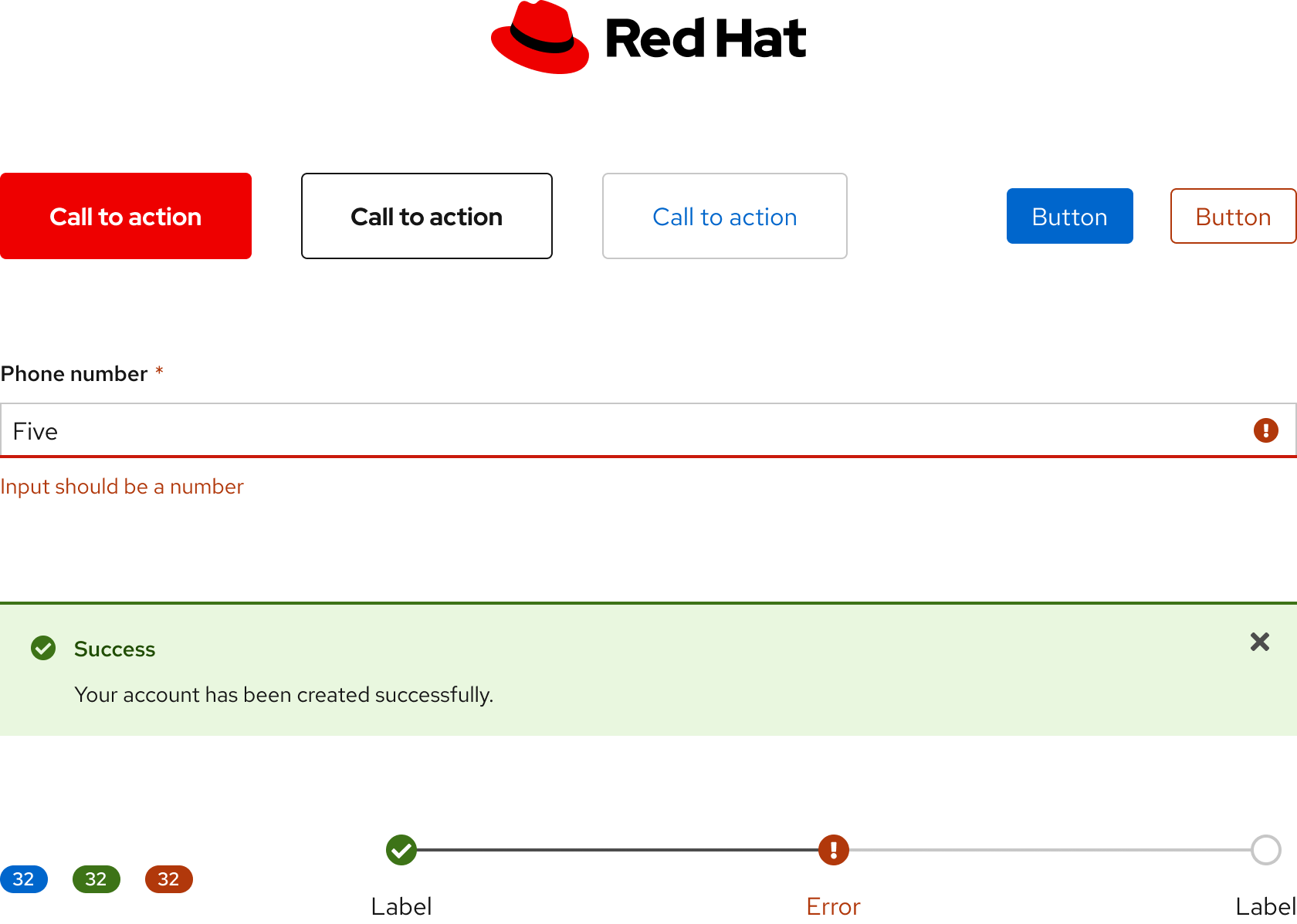
Our color palette is designed with brand, usability, and accessibility in mind and is used for all projects across Red Hat. Applying color thoughtfully and consistently helps us create cohesive, recognizable, and engaging experiences for our users.
Color relationships
When colors are used together, they form relationships that communicate brand, hierarchy, state, and more.
Color design tokens
Design tokens are the source of truth of our design decisions. They allow for changes at scale, making design language updates easy to implement.
To learn more about our color design tokens, go to the Tokens section.
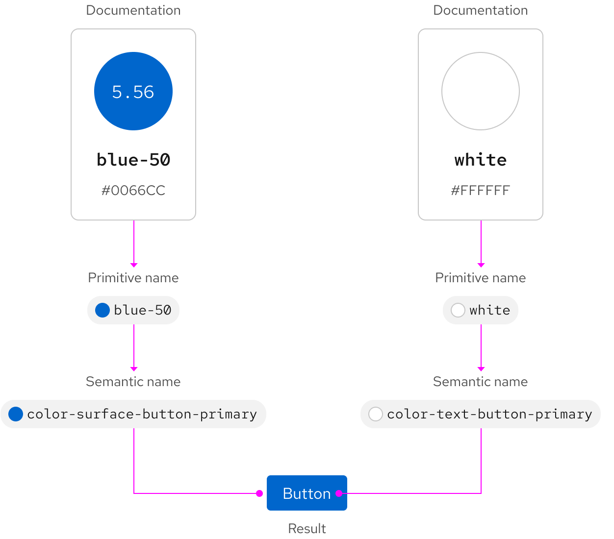
"Crayon" and semantic colors
Our design system includes multiple sets of colors known as "crayon" colors. Crayon colors reference hard-coded values, but offer no information about usage. Semantic colors reference crayon colors and define how a color is used. Semantic naming is essential not just for color, but for all foundational styles.
Other libraries
To learn more about our other libraries, visit this page.
Feedback
To give feedback about anything on this page, contact us.
Foundations
To learn how to use our other foundations in your designs, visit the foundations section.
